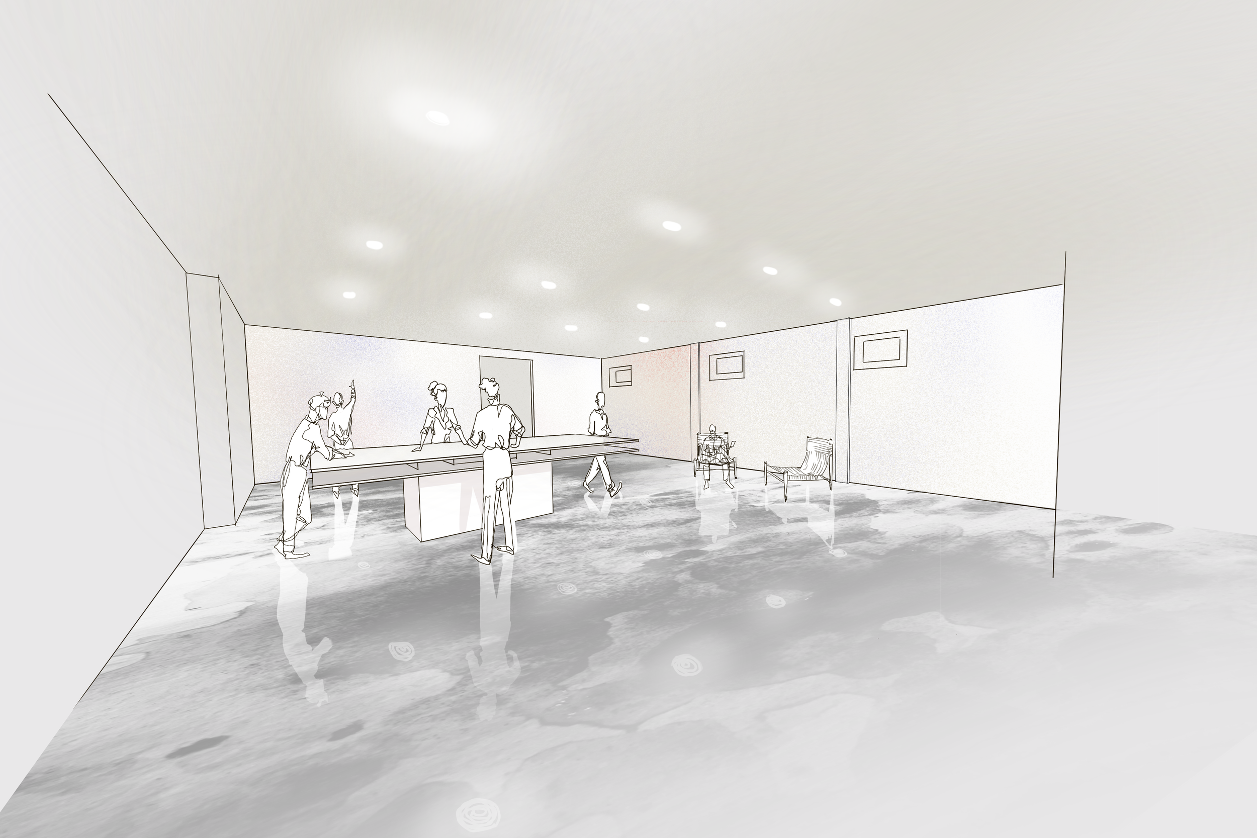
The following work was done for Jerri Hobdy’s environmentally friendly furniture brand, Meno Home. The work shown is a range of process, overall brand design, and logo design.
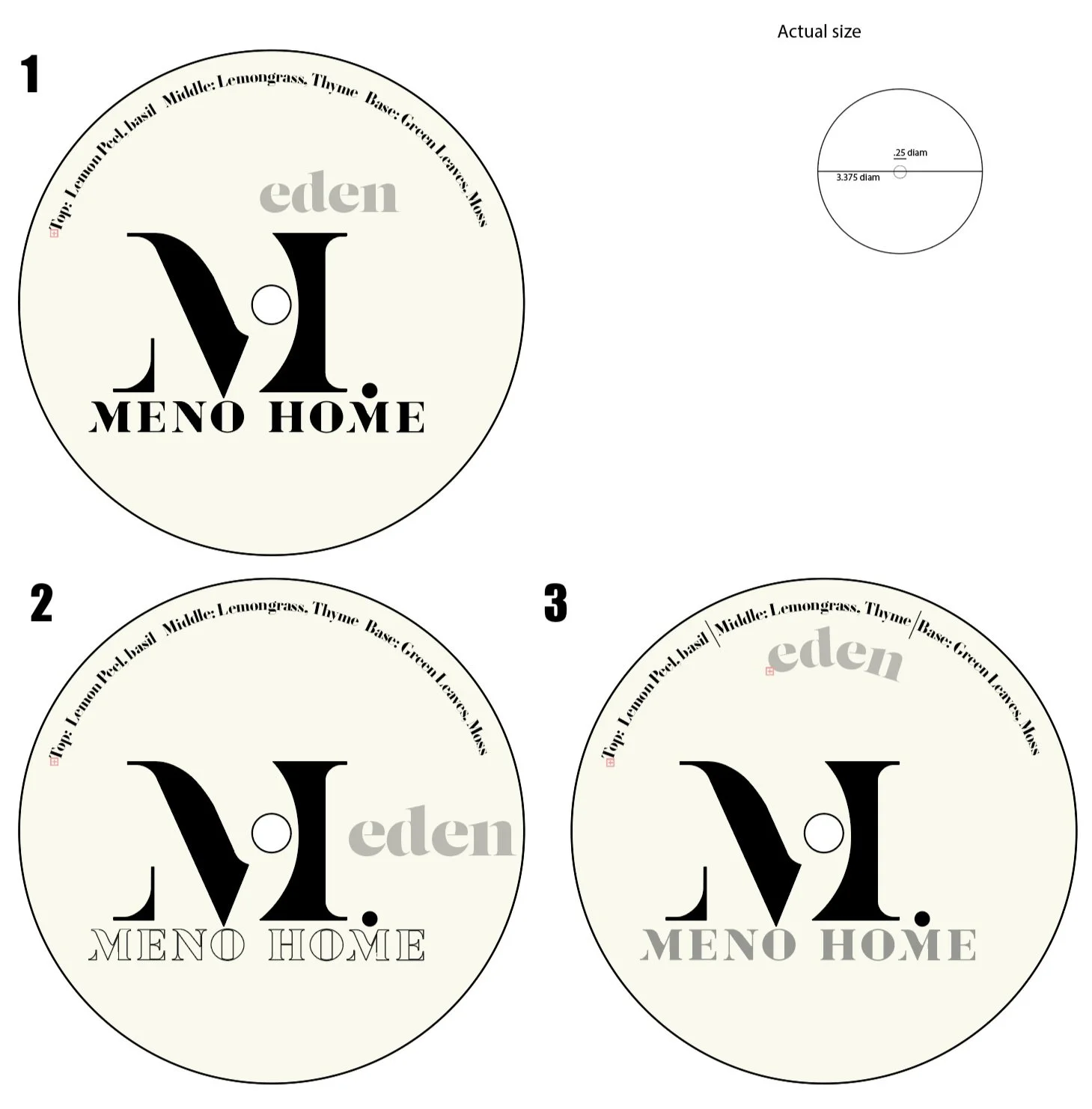
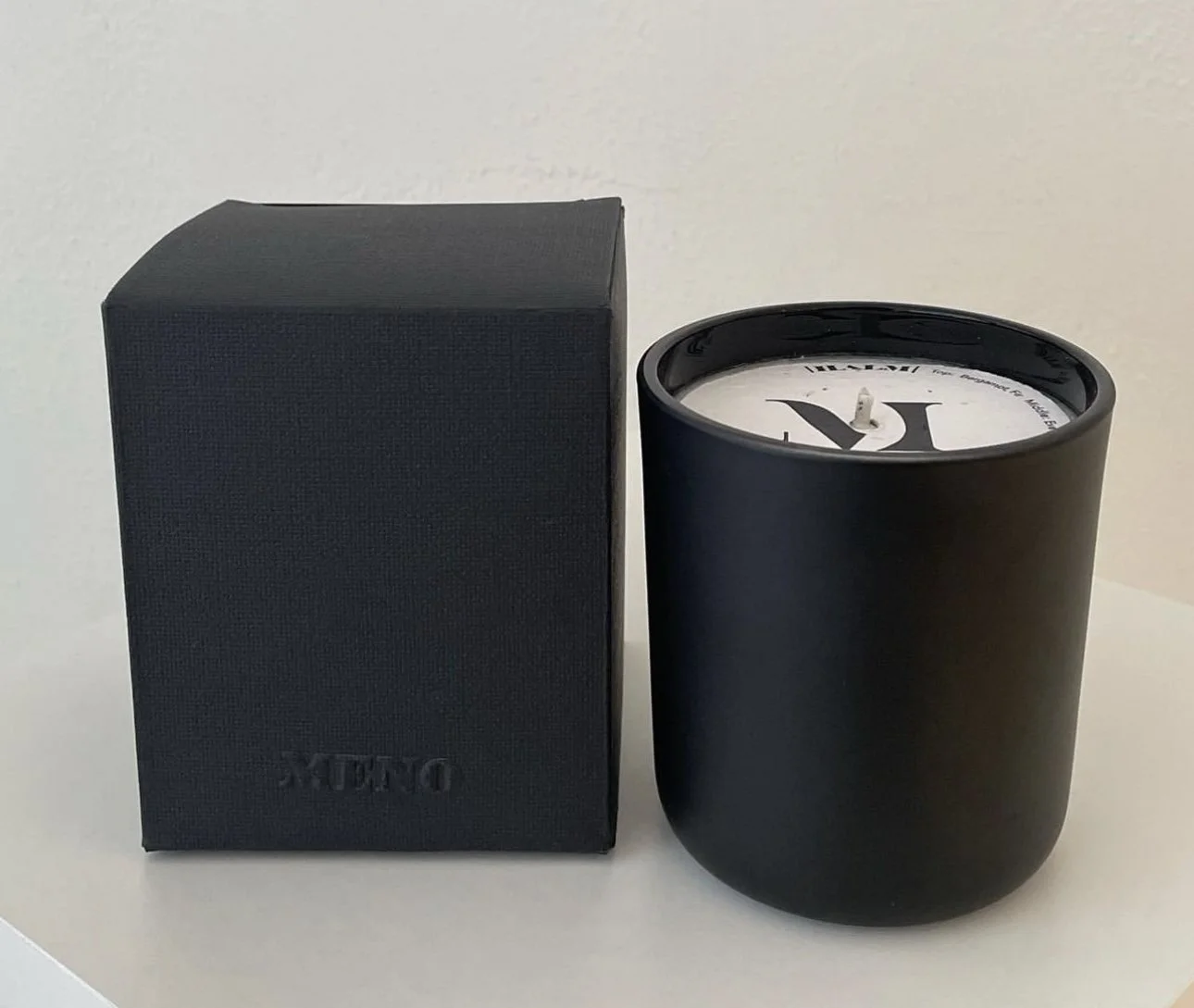
For the “M” icon I wanted to reflect the “circular” brand model within the logo. However, the shape of a capital M is square. In order to use the circle in my design I had to use it in the cuts of the black shape shown in the final icon.
This video is owned by Jerri Hobdy & MENO HOME - Filmed & edited by DrewTheDirector
MENO WORK
To expand the brand identity of MENO during the pandemic, I was commissioned to do some small-scale product design. The discussions ranged from soap trays to candles. The slideshow below shows the process for the logotype design, icon design, product design, and final photography.